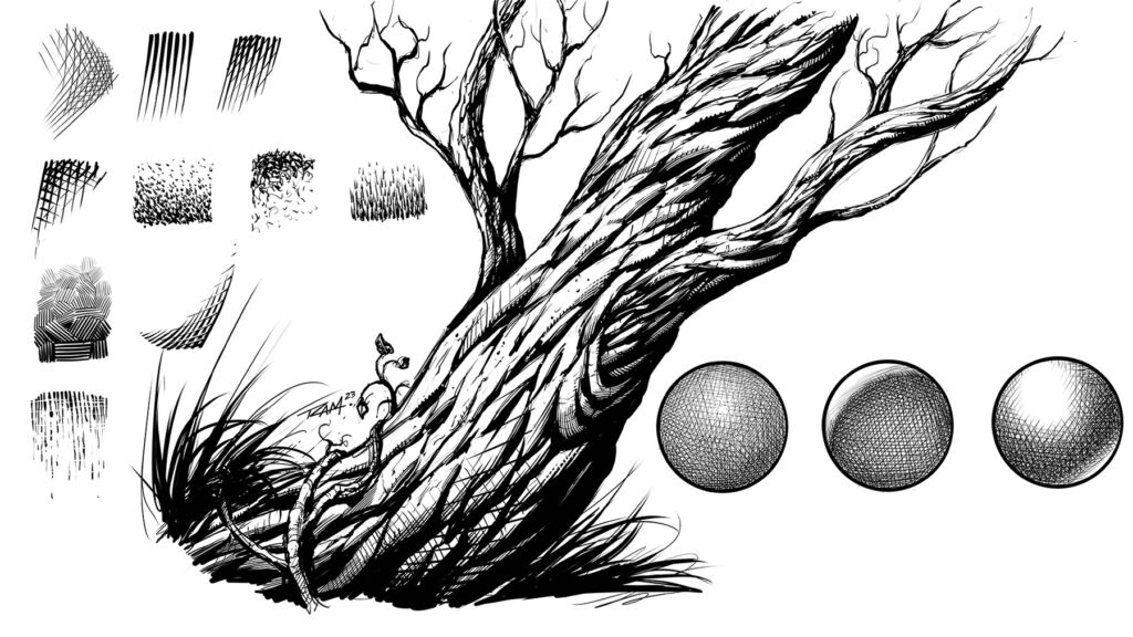
On this page you will find various drawing tutorials for comic artists. You can click on the images to enlarge and draw along. Share your work and this page if you find these lessons to be helpful!
Let me know what other art tutorials you would like to see covered on this site and I will make sure to add them as soon as I can!
-Rob

Welcome Back Fellow Artists! Today I am going to show you 3 quick and easy ways to blend paint in Read more
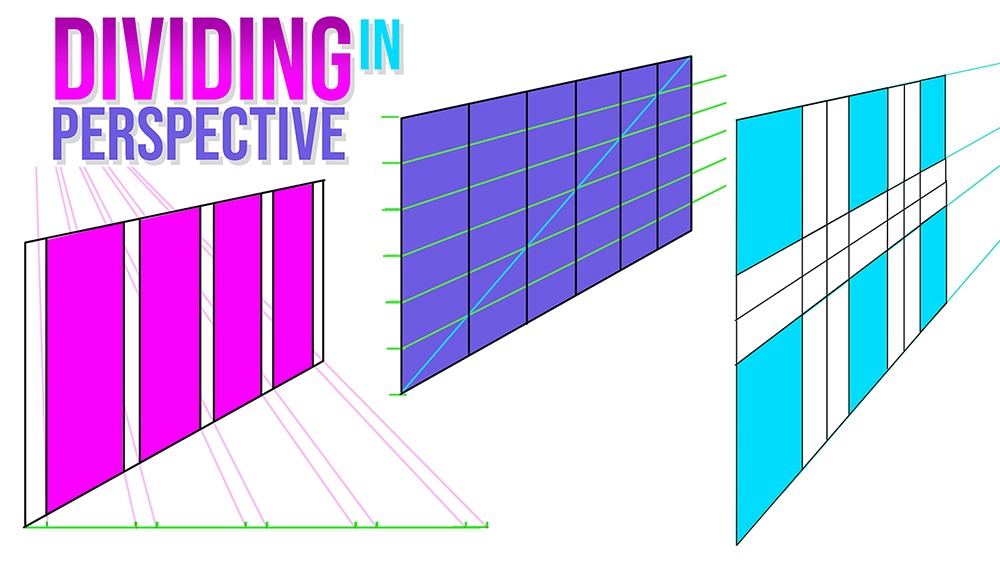
Welcome Back Fellow Artists! I have been really enjoying perspective drawing lately. It is such an amazing thing to be Read more
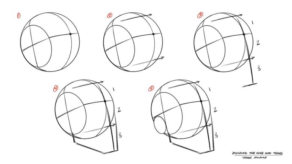
Welcome back fellow artists! In today's post we will delve into the exploration of drawing heads from various angles. This Read more
Hello Fellow Artists! I hope you are having a great day wherever you are. I will assume you are doing Read more
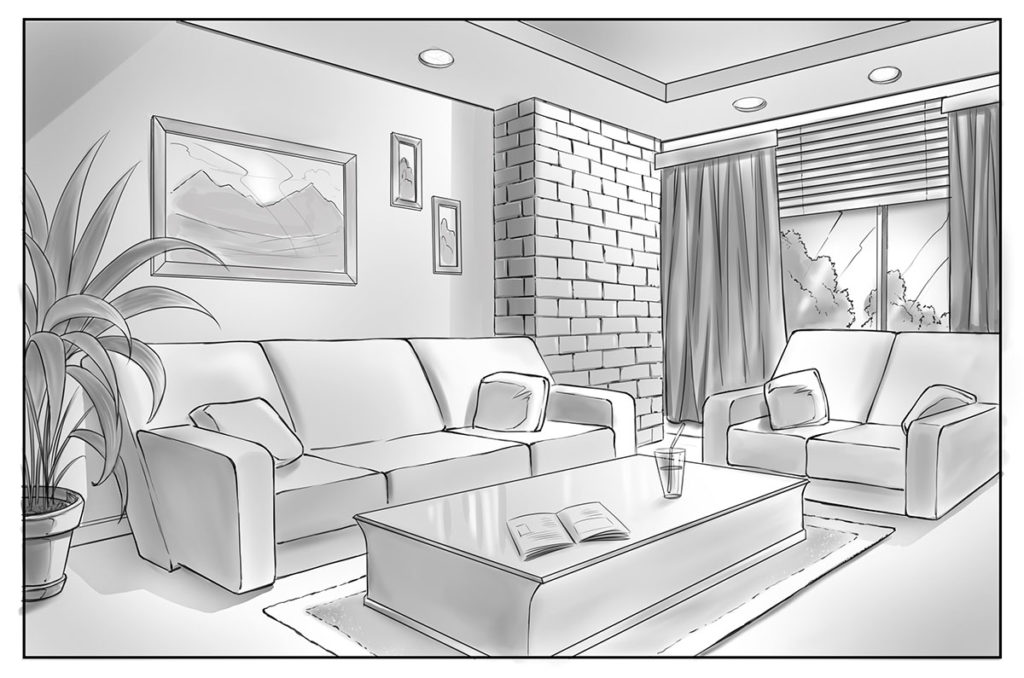
In today’s tutorial I will show you how to draw backgrounds using basic perspective techniques. Drawing in perspective can seem Read more
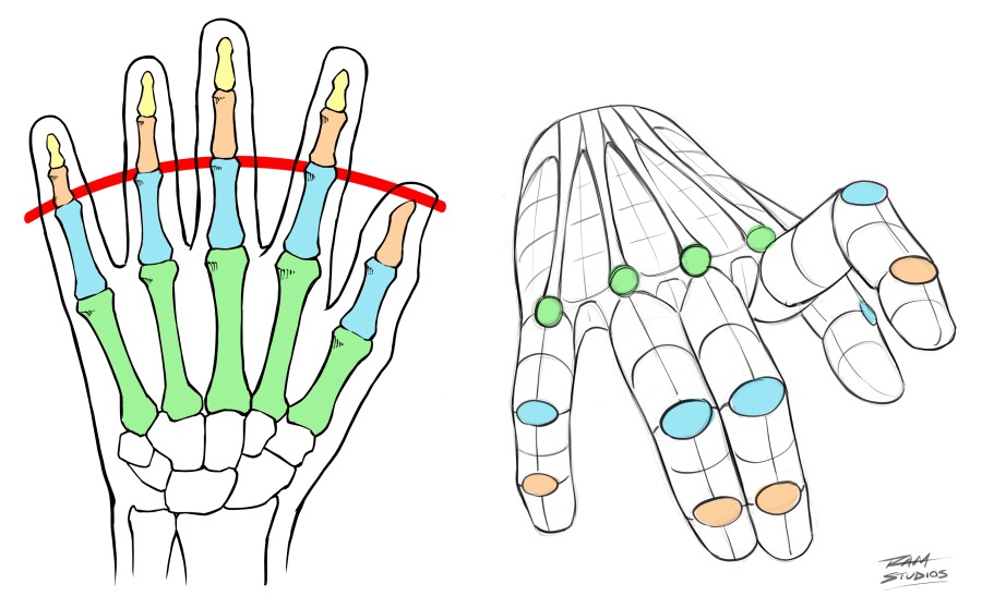
In today's drawing tutorial you will learn how to draw hands by studying a few of the primary techniques that Read more
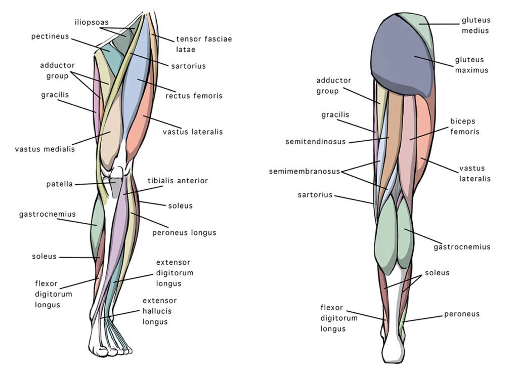
In today’s art post I will be sharing my 5 tips on how to draw leg anatomy along with some Read more
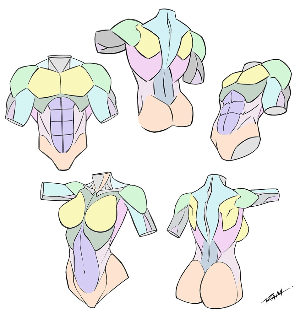
Welcome back fellow artists! In today’s tutorial I want to share some techniques on simplifying and drawing the torso of Read more

Drawing characters that have a variety of expressions is essential to telling a good story. Nothing worse that everyone running Read more
Learn to Color Comics in the Procreate app Step by Step! Do you want to learn how to color comics Read more
14 Comments
Hauke Bahr · September 19, 2022 at 8:53 pm
Hi there,
I am just starting out learning how to draw. My goal is comic style art. Big fan of your YouTube channel. Just discovered your Gumroad site. I am considering buying one of your courses but I’m not sure which one to start with. Which course would you recommend for a beginner wanting to learn how to draw comic book figures? I see you have several that dive into the figure, dynamic poses, and anatomy. Where should I start?
Thanks!
RAM · September 23, 2022 at 4:58 pm
I answered you back in the email. Let me know if you have any other questions and thank you for inquiring about the course content. Good luck with your art! -Robert
Samuel · November 7, 2022 at 8:42 pm
It’s actually a great question. Do you think that you could send me the same email. I really appreciate it. I am also going to send you an email. I want to know if the tutorials with procreate in Photoshop are geared towards the iPad Pro? And if so are there directions on how to download save and install
RAM · December 14, 2022 at 2:56 pm
My apologies for the late reply. I somehow missed this message. The Photoshop courses are taught using a desktop computer. The only thing that I teach on the iPad Pro is the Procreate app. I will send you an email and see if I can help you out any further. Thank you for inquiring.
Esperanza · September 30, 2022 at 10:12 pm
Hello,
My brother, who’s autistic, is interested in doing his comics, but he has trouble drawing monsters, and I saw a course over on howtodrawcomics.net and was wondering if we have to pay $15 for the whole class or do we have to pay by the month.
RAM · October 1, 2022 at 1:32 am
You only have to pay once and you own the content forever plus free updates. If he has any questions about the course don’t hesitate to ask. I will do my best to assist him. Thank you!
Joshuaosiris · December 5, 2022 at 6:41 am
I have bought several of your courses. I just wanted to write that I think what you are doing is awesome! It’s really help me get better as an artist. Until I found your course I felt lost and unsure if I could ever be an artist. Thank you and keep this great thing going.
RAM · December 14, 2022 at 2:46 pm
Thank you very much for the inspiring comment. I truly appreciate that. You can achieve whatever you put your mind to. We just have to keep working hard and be grateful for our progress, which it sounds like you are. Have a great day and keep up the good fight!
Lucky rout · February 9, 2024 at 11:38 am
I learn from little bit tutorial from images and it’s really helpful i easily learn ❤️👏👏
Lucky rout · February 9, 2024 at 11:40 am
I learn from your picture tutorial and it’s really easy to learn thanku Ram sir doing great job ❤️👏👏
A_Kid_That_doz_stuff · October 20, 2025 at 8:03 pm
I was just looking for leg anatomy tuts on my school computer and found this! tysm!
Developer · October 29, 2025 at 10:10 pm
Glad these tutorials can be useful and best of luck with your art studies!
evie · November 14, 2025 at 2:44 am
can i have lip tutorials?
Developer · December 17, 2025 at 4:44 pm
Yes, I will work on those very soon and thank you for your request!